Trip Advisor Illustration
Corporate identity is getting more and more humanized. Fine illustrations, created with lots of expertise and understanding of the industry are now incomplete without a pinch of personality in them. Slack was a pioneer, and it pleases me a lot that a number of teams, eager to tell a story via their illustrations, is growing. I am using this trends and my specialist to work on Trip Advisor’s App as a personal project to help them bring more playful personality for their branding.
INTRODUCING A STYLE
To know the goal, demographic is important to expand the illustration for the corporate identity. As a travel lover, I like to use this app when I travel. Travel is a relaxing, fun thing to do and I want to bring that fun and playful feeling to the audience using the new brand design. The new branding of Trip Advisor uses 5 basic color - black, white, green, orange, and yellow. I followed the style guide of the new brand design by using the same color, working with dot, line, and shape, add some storytelling, developed the illustration style that was simple, clear and delightful.

ADDING DEFINITION
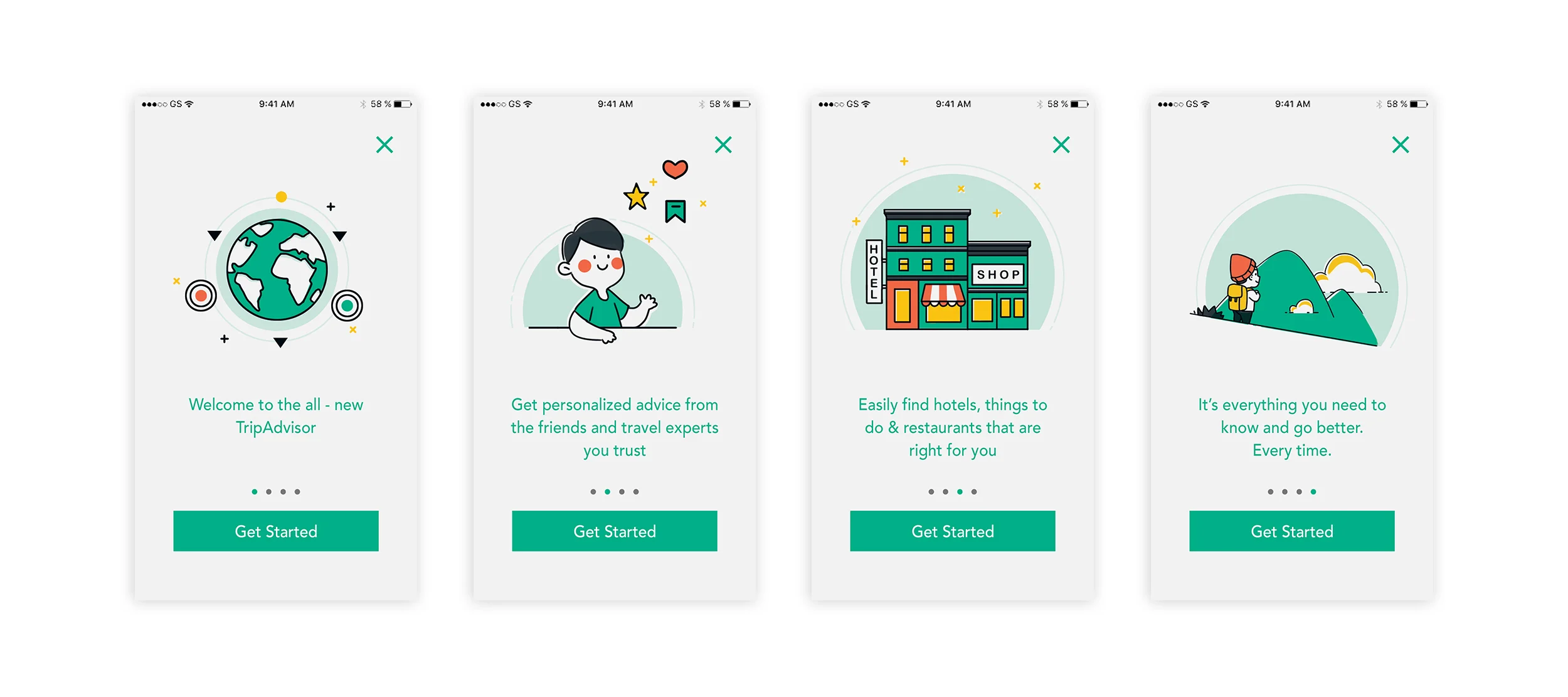
When you first open the app, you will land on the “Welcome to the all-new Trip Advisor” page. “Welcome to the all-new Trip Advisor” for me, means this is a whole new world of Trip Advisor, therefore, I use the earth as a main element. I also used the owl’s eyes which are the orange dot with black circle and the green dot with black circle, on each side of the earth, like the planet around the earth. By using dots, lines, and shape, I wanted to create a “solar system” for the first page of the onboarding page to introduce the new brand design of Trip Advisor, with the goal of bringing the good start and fun for the company and its audience.

Before

After
animation is coming soon
“Create your first Trip Page” illustration
Another key piece I worked on is “create your first trip” page. There’s a big empty space on this page and I tried to use a clear, fun element to encourage user to use this function.

I’ve created a range of visual style explorations for this, hoping to see which style fits the new branding direction that I’m approaching. I’ve tried full on coloring illustrations to just strokes and outlines before selecting the one I see works best in this scenario.
